1. Having watched the video with Nigel French – describe, in your own words, what each of these colour systems means: RGB and CMYK.
RGB = Red, Green, Blue. Use for digital designs. CMYK = Cyan, Magenta, Yellow, and Key. Use for anything printed.
2. Make use of Kuler and develop four different colour schemes. You must hand in screen shots of your schemes as done with Kuler: a) Monochromatic
Monochromatic
b) Complementary
Complementary
c) Triadic
Triadic
d) Analogous
Analogous
Question 2
Use a colour photo of your choice and create the following colour effects (as per Nigel French’s video) – you should hand in four separate works of the same photo with the following effects:
Design a CD cover for a fictitious band called “The Typos”.
You may determine the title of the CD as well as any one of the following genres for the band: Indie Rock, Electronic or Hip-Hop.
2.
Use a visual and typography to design the CD Cover and remember to make the type work with the rest of the design.
The cover should have a front and back and be 120 mm x 120 mm in size.
3.
Expand your design onto a booklet of 8 pages – where the song lyrics are laid out. You may use fictitious type for the lyrics. What is important, is that the type you choose for your titles, body copy and accent copy should form part of the rest of the design (on the cover as well) and express the underlying character of the band.
For this assignment, you need to explain the anatomy of type in a visual way. Use a single typeface or compare up to three different typefaces – enlarge or reduce, cut out sections or overlap parts – anything that helps explain the terms to the viewer. Use a maximum of three colours to full effect by using the second and third colours sparingly, and only to add emphasis. For instance, explanatory text could be in one colour, and the parts of the letterforms in the others. Show at least three terms on each of the sheets, for example x-height, cap height, body size, counter, serif, ascender, bowl, baseline, stress/axis, stroke weight and bracketed serif.
The explanatory copy can be taken from the textbook (pp. 66-68). The format should be a 210 x 210 mm square.
There are three stages to the design as well as a production stage, when you will produce your designs on the computer. The point of having different design stages is so that you will fully explore ideas before going to the computer to produce them.
When you hand this assignment in, please include copies of the different stages, so we can follow your thinking process.
Also, create a “new” word, which has no dictionary definition, and a meaning that only you know. For example, the word I came up with is “roleean”, it doesn’t appear in the dictionary, but it means, “round and leaning to the left”. You should decide on your own “word” with its own meaning. My typographic treatment of the word “roleean” might involve emphasising/dramatically enlarging the letter “o” within the word, and using italics to have that letter leaning to the side.
Transition
Repetition
Boltalic – Bold & Italic
Create three different compositions for your three words, one word per composition. In each, arrange each word to express its meaning, using either colour or black and white. Consider all and any means at your disposal: dramatic scale contrasts, cutting, repetition, letter spacing, etc.
Each composition should fit onto an A4 format. Vary the size, spacing, placement and orientation of letters. Be aware of how the word (or words) interacts with the entire format.
Consider the entire format as an important design element: use all available space; don’t simply centre the word – think of this as an opportunity to direct attention throughout the entire layout. Experiment. Play. Push to the edges of the page. Repeat elements if it helps to get the meaning across. Choose a very simple creative solution, if that’s most appropriate.
Use only one typeface for each composition, noting the appropriateness of the choice of typeface to the word explored; you can mix variants of one (light, bold, condensed, capitals, lowercase). You may repeat, omit, slice, block or overlap words or letters.
However, do not use drop shadows or horizontal/vertical scaling (distortion). Consider the entire space of the format as part of the design.
You will have to supply all your preliminary sketches and ideas along with the final layouts – the process of drawing by hand is important.
You can start your project and explore ideas by tracing letters, cutting and pasting computer-generated words, photocopying, photographing or by any combination of these methods. Be inventive. Later, once your ideas are developed, you can use a program such as InDesign, Quark or Illustrator to rework and refine the design. Take time to consider the various options; don’t just do the first thing that pops into your mind. Explore all possibilities for enhancing ideas.
This assignment has been about creating a logo. A new logo for a restaurant/Pub called FOOD & MALT. This has been a challenging process and there was a lot of things to consider while doing this assignment. A lot of time has been put into research, idea development and design. The logo had to be simple and traditional with a modern twist as well as being recognisable.
The research part has been one of the most time consuming, yet the most important part of this project. I had to gather information about my competitors to make sure I created a unique competitive design. I also had to fully understand dude-food concept as well as microbreweries.
The audience is young urban individuals between the ages of 18 and 35 interested in culture, food, design, trends and night life. This subculture can often be referred to as hipsters. Hipsters can be explained as educated and sociopolitically informed millennials, who grew up in middle to upper class families, and live in urban areas. Hipsters typically listen to indie rock and alternative music, have politically liberal stances, buy organic foods and products, and protest popular, highly-commercialized clothing brands by shopping at thrift stores. Hipsters pride themselves on their up-to-date knowledge of social issues, intelligence, creativity, and appreciation of art, music and food. This sub group is interested in trends. Modern microbrewery has been a growing trend as breweries has constantly been expanding their sortiments. Dude food is a recent food trend largely consisting of heavy, meaty dishes that are thought to appeal to men or express masculinity. This would attract this sub group to explore new interesting products within food and beer. Since the sub group is also interested in design, it will be important to design the right logo as its the first impression they will get.
The Design challenge has been to show the company in a simple, easy and recognisable logo. I had to look beyond the obvious and find a design that helps to differentiate Food & Malt from their competition. The challenging part about the colours will be to choose the right ones to express the right atmosphere and theme. This logo has to be designed to look good everywhere. It can be used on different materials and different coloured backgrounds.
Before I started sketching I did some research about the competitors to get an idea of my competitors and how to distinguish my design for theirs. I started using some keywords to get some ideas, as well as inspired to create my logo for Food & Malt. The keywords used are; Hipster, Young, Wheat, Beer, Traditional but Modern, Urban restaurant, nightlife, pub and quality.
Sketching processSketching process #000000#915c34Illustrated in different scenarios
Look at the following 7-eleven logos and consider their shape, form and simplicity of design. The way they communicate and are recognisable.
The seven eleven logo to the left is recognisable. It consists of six elements, which makes it simple and communicates well. It is natural to read the 7 first and then the eleven, but for some people this may still be an issue.
The logo to the right is more simple and straight forward. It’s the same number 7 as in the left logo, connected to ELEVEN by a dash. The viewer will not mistake the how you read it this way.
2. Identify. In your own words explain what you consider 7-Eleven’s individual Gestalt principle to be. Describe the logo and put it into its own category.
I see both the gestalt principles continuation and closure in the first. The “7” is split into 3 separate parts in the first logo and 2 in the second one. The second logo I only see the closure principle.
3. Pick any 3 gestalt principles and recreate 3 versions of the 7-Eleven logo according to your chosen principle. Be creative and innovative with how you do it. Sketch, plan, do it by hand before digitally creating your favourite in a vector format.
I chose Closure, Continuation & Symmetry. I chose to do the closure one in Illustrator.
4. You entire process including sketches and research need to be loaded on your blog as part of this learning activity.
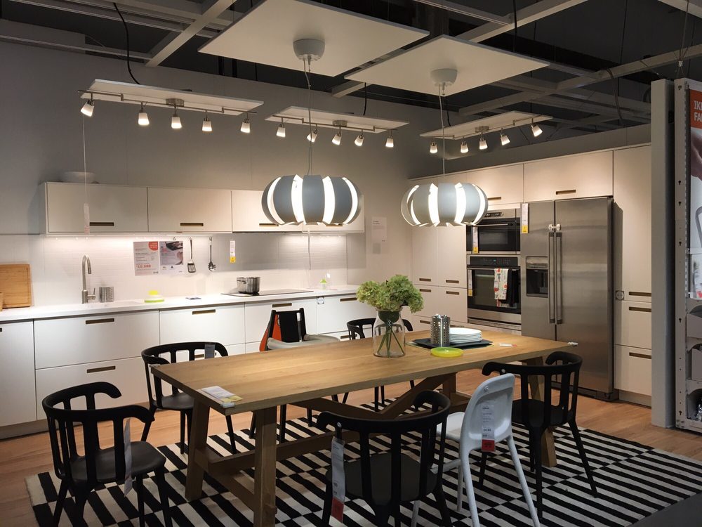
Visit a popular store, like an Apple, Nike, Levi, H&M or an Ikea store. The brand should be well-known and you must visit a shop where their products are being displayed or distributed. In smaller towns you may not have access to these stores, in this case you will need to find a section showcasing these items and view how they are displayed or laid out. Before going to the shop, determine the following about their brand identity and, once at the shop, evaluate how they remain true to their brand identity or not. How is the brand identity enhanced (or, perhaps, not expressed) at the point of customer interaction? Hand in a write-up with photos of the following:
a) What brand identity element are they using in their logo (e.g. abstract mark or word mark)?
Ikea is using a letter mark (monogram) logo. A typography based logo that take the abbreviated initials of their company and spruce up their design a bit. They are using the Swedish flags colour in the logo to reflect their Swedish identity.
b) What do you think their brand ideal is?
Simple, modern, cheap, innovative.
c) How do they remain true to their brand ideal within their shops?
They remain true to their brand ideal within their shops by displaying modern, cheap and simple design furniture all over their store.
d) Evaluate the customer experience according to the brand ideal. (For example, if the brand ideal is “innovation”, do you get a sense of that ideal when you visit the outlet?)
The customer experience I get by walking through the store does reflect their brand ideal very clearly. The design of the furniture is minimal and simple. I do see cheap prices throughout the store. I get a feeling of their Swedish identity by being in the store. They reflect this in many places, the logo, the restaurant, having Swedish cookies etc. through the store. The is a lot of innovative products as well, for example smart lamps, and speakers integrated to furniture.
e) Evaluate the visual display of the products according to the brand ideal. (For example, if the brand ideal is “value”, is this expressed in the way they display the products?)
The products are displayed in many different ways. Each product for its self and many products gathered together as a “room” so you get an idea of how products would fit together. They do express modern and simple design. I would say that “cheap” is not reflected everywhere as some few products are a bit expensive. The visual display is very innovative as they create a need by contextualising their products.
Look at the following logos and explain in your own words what you consider their positioning to be (do this for each one).
Positioning defines where Your Product stands in a relation to others offering similar Products and services in the market as well as the mind of the Customer.
Cocacola has strategically positioned their company worldwide in the soft drink market. They have positioned their company by their old slogan “Think global, act global”. They made their soft drink recognisable all over the globe, moreover they kept the same profile all over the world, as if it is a global language. They also positioned them selves by playing on your lifestyle strings. “Taste the feeling” or “Share a Coke” . They have also become known worldwide for their Christmas spirit but using Santa clause in their commercials.
VW has positioned themselves in the car manufacturing market by being true to their vision “we are a globally leading provider of substantial mobility”. They position themselves as leading with environmental friendly technology, safety and reliability.
Visa started positioning themselves by “to be the best way to pay, and be paid”. As they were growing world wide they added a new inspiration “for everyone, everywhere”. This is how they have grown today, to be available worldwide for everyone.
2. Lets work backwards! Look at the logo on the Apple iPhone and, by doing your own research, investigate the history of the product and the company that manufactures it. Give an outline, in your own words, of what you consider the following to be:
Describe its brand identity – exactly as you see it
Apple´s brand identity is user experience. They focus on their devices being as user friendly as possible and simple with a good design. They go after emotional branding.
What do you think its positioning is currently?
Apple is currently positioned as a user friendly luxury brand that carries a huge emotional connection and loyalty among its customers.
What do you think the strategy for this specific product was?
The strategy for the iPhone started when it was first released with no competition which gave the iPhone a head start before other competitors came into the market. The iPhone then was a way head of its competitors and the customers started getting loyal to that specific product, even if the price was much higher. Their strategy was to make their products as good as possible, user friendly, easy to use, and at the same time focus on design as well as the customers emotions. This culture has continued, in this way apple can still continue to price their iPhones above other competitors while their costumers continuing to be loyal.
What research do you think was done on this by the company who made it?
A lot of research much have been done. Some of it must be to
make your phone as a «little “computer”. They integrated music,
mobile data, a proper touch screen etc into their device. The other
parts must have been to focus on simplicity and UX.
3.Now take the same product as in question 2 and explain, in your own words, how the visual element (in this case, the logo) fits in with the brand identity.
The logo is simple, easy to recognise, minimal, creative as well as modern. Apple as a company stands for all of those descriptions above.
You are briefed to do an illustration for fruit juice packaging (orange and banana flavour). The name of the product is: Loose Juice.
Draw at least 15 scamps (they can be A6 size each) of what the label will look like. Remember to include the fruit, the name of the flavour and the name of the product.
Choose one of your sketches and draw the label, using Adobe Illustrator. The artwork can be A6 (landscape or portrait).
Sketches for Logo
Final product made in illustrator. SVG file was not possible to upload so I had to convert it to PNG using Photoshop.
A man is replacing a wheel on his car, when he accidentally drops the four nuts used to hold the wheel on the car. They fall into a deep drain, irretrievably lost. A passing girl offers him a solution that enables him to drive home. What is it?
My thought would be to take one nut of each of the other three weels to use them on the one you’re changing. This is a temporary solution until you can replace the ones lost.
Two Russians walk down a street in Moscow. One Russian is the father of the other Russian’s son. How are they related?
Thet are husband and wife
What occurs once in June, once in July and twice in August?
The letter U
Six drinking glasses stand in a row, with the first three full of water and the next three empty. By handling and moving only one glass at a time, how can you arrange the six glasses so that no full glass stands next to another full glass, and no empty glass stands next to another empty glass? What is the minimum number of moves to solve this puzzle?
The problem can be solved by moving one glass. Picking up the middle one of the full glasses, then pour the water into the middle one of the empty glasses, and then returning the glass to it’s original position.
Question 2
Research and written and assignment
1. Use the Internet to research the history of the fast food chain McDonald’s and explain which parts of the SCAMPER model are evident in its development onto its current success.
Substitute something
McDonalds substituted an ordinary restaurant concept (with waiters, ordering process, payment etc), into efficient delivery with a small menu. Then they were able to deliver quick “low-effort-making” food, today known as Fast-Food.
Combine
McDonald’s focus went from just burgers, to a whole new range of products and services. For example introducing the “Triple Thick Milkshakes”, “Big Mac”, and the “Hot Apple Pie”. The Happy meal, introduced in 1979 is also another example – special meals directed towards children.
Adapt
The customers had made it clear that they wanted to sit down and eat, so McDonalds installed indoor seating in all of their restaurants.
In 2003, they adapted to the new health focus of society, and started a global marketing campaign to promote a new healthier and higher quality image. The campaign´s slogan was “I´m loving it”, and this slogan is still used today.
McCafé was started to please the coffee lovers everywhere, and you can now find a McCafé in almost every shopping mall in america.
McDonalds is adapting alot, all the time. They always try out new things to put on the menu, and quickly change the things that don´t work.
Modify and magnify
Wrapping the burgers in paper rather than plastic led to a reduction in the wrapping material waste stream.
In 2010 McDonalds added free Wi-Fi to their restaurants.
Put to another use
McDonalds has developed from being a restaurant to be a fast-food chain.
They have focused on recycling.
They have added Drive-Through.
McDonalds started supporting the Olympic movement in 1968 and is still the top sponsor of the Olympic Games up until 2020.
Eliminate
McDonalds eliminated the waiters, making the customers order and pay at counter.
Reverse / Rearrange
Redesigned and improved the look of the restaurant as well as logo.
Question 3
Practical assignment (problem solving)
You are given a teaspoon as an object. Now apply each one of the SCAMPER techniques to it and give a brief explanation of what new product comes of this and how it can be marketed.
Substitute something: Instead of being an ordinary teaspoon made of metal or plastic, my product would be made out of sugar. When used in hot drinks such as coffee or tea it would dissolve. This product would be cheap as well as easy to produce.
Combine with something else: This product could be combined with special sugar colours that would be targeted towards children.
Adapt: Adapt a new health focused theme and and promote a new healthier as well as a higher quality image.
Magnify: Choosing brown sugar instead of ordinary sugar would help out with the new image goal.
Put to other use: Focus on being environmental friendly and recycling. Another thing would be sponsoring big charity events to show that we are using the company in good humanitarian cases.
Eliminate: We would eliminate some of the packaging to become more of a simple and environmental friendly package.
Rearrange: Redesign and improve the look og the product, company design, and packaging.
You have to design packaging for rice. The packaging has to be different from what is out there in the market. Apply each one of the SCAMPER techniques and do a write-up on your findings. Then choose the option that you think would work best and do a sketch of what the packaging would look like.
My rice package
Rice is a worldwide product, and theres plenty of different rice packaging concepts and designs. As a starting point, I would like to focus on space saving, as well as an eye catching packing with an environmental friendly focus with a hint of a minimalistic design.
S-ubstitute:
The most common shapes of the rice packages are either rectangular or square. The most common materials used are cardboard and plastic.
I have the possibility to substitute current packaging with other materials such as glass, wood, metal, or textile. An even better and more environmental friendly type of cardboard/paper can also be introduced.
The form can be changed from rectangular or square to oval, triangular, circle, cylinder, octagonal etc.
I will use environmental friendly cardboard with a cylinder shape.
My sketches of rice packaging
Combine
When we eat, we tend to care about the looks and design of the food. We also value the variety of the food.
This is why I would like to combine different type of rices in the package, such as black rice, whole grain rice, white rice etc.
This would be in a separate package inside the main package.
Adapt
To adapt my product to fit its segment, I need to consider that the fact that many of them are on schedule and time is valuable. This is why I would like the rice/product to be as easy and fast as possible to make. I would adapt self dissolving rice bags with no taste or smell which are safe to use.
M-odify, magnify, minify
I would like to make the products in different sizes. L, M and S portions. The average bag of portion is 120 g which is for two persons. This way it would suit the whole market. For single persons, families, and couples.
Put to another use
This type of packages can also be used for other products, such as Couscous, bulgur etc.
E-liminate
I could eliminate the main package and sell the rice bags by themselves with its own little paper, cardboard or plastic cover.
Rearrange / reverse
The different types of rice, could also be sold separately instead of a combination in one package.