Written assignment (4 hrs)Describe the steps that you will take to ensure that you take a high quality photograph in low light conditions. Refer to exposure, lenses, tripods, colour temperature, flash and ISO. Your answer should be a minimum of 350 words.
Exposure: When it comes to photographing in low light it´s important to change your camera exposure (shutter speed). The longer the shutter speed is the lighter the photograph will be
Photographing moving objects: When photographing moving object in low light with longer shutter speed, the moving object will make a blurred trail, this can be very interesting in photographs and should not be looked at as a bad thing, it can give more expression to the photograph than with shorter shutter speed.
Setup: When photographing in low light it is best to use a tripod. When you shoot in low light you will need to make the shutter speed longer, making the camera be more sensitive to movement, creating a blurry image, this is why a tripod is an essential thing to use.
ISO: Iso goes hand in hand with shutter speed, the higher the ISO the faster the shutter speed can become, but there are things you need to sacrifice with this option. When you shoot with higher the ISO the more grainy the photo will get, so it´s always recommended to have the ISO setting no higher than 100.
Photo quality: It´s best when shooting in low light to use Raw image quality, it´s the highest possible quality and will make your photo better and sharper. Raw also captures the image without image processing, giving you more options with your editing software.
Color temperature and white balance: Different light sources have different colour temperature, daylight has a blue tint, fluorescent light has a green tint and a household bulb has a yellow/orange tint. It´s important for you camera to know in these light circumstances what a white looks like. Some lighting scenarios have mixed temperature you can set your camera to AWB(auto white balance) to fix the tempreture.
Flash : The most important thing when using Flash in low light is to now when to use it. It is not always a good thing to use flash because it can cast a strong shadow on your image.
During this assignment you will get familiar with working in a darker environment and how it affects buildings and people while using slow shutter speed.
Learning Activity
Fun with slow shutter speeds
Wait until it’s almost dark outside. Take your camera and go and sit in a busy tourist area. Choose a building or statue to photograph. Place your camera on a tripod and set the shutter speed to 30 seconds or more (if you don’t have a tripod, something stable, like a chair, will also work. If you don’t live close to a busy street, just get one or two people (or even your dog) to move up and down past the camera during the 30 seconds). Take a look at your photograph. Do you see a lot of people in it or just the building/statue?
Wait until it’s dark. Go and stand on a bridge over a busy street (or look from the window of a high-rise building). Place your camera on a tripod and set your shutter speed to 30 seconds or more. Inspect your photograph. What do you see?
(If there’s no bridge or high-rise building close to where you stay, find a street where there are some cars driving or alternatively ask a few people to help you by driving up and down your street. You can even pay an taxi/uber-driver. Ideally you should capture this from a bit higher than street level. You can ask a hotel in your area to use their window or the flat of a friend that stays on the second floor. Some buildings have a secret stairway to the roof… be creative, and safe!)
Ask a friend to help you with this activity. Choose a dark room in your house and switch off the lights. Place your camera on a tripod and set your shutter speed to 30 seconds or more. Ask your friend to “draw” a picture in the air using a flashlight. Take a look at your photograph. What do you see? This fun activity is called light painting. Try an easy pattern first, but also a more complicated one.
Written assignment (Research and analysis) (1 hour)Draw up a list of the most important aspects of a product photograph. Refer to shadows, lighting, quality, ISO and editing in your answer. Mention at least five things.
Important aspects to product photography A Clean background Soft contact shadow. And normally soft shadows on product. Even lighting. Low ISO to reduce noise. Tripod and shutter radio may be used to reduce shake. The right lense to avoid distortion and to maintain a sharp image.
As for editing product retouching, curves, contrast, brightness may be used to make the photo more appealing towards its target.
Question 2
Practical assignment (6 hours)
Make your own DIY light tent.
Take product photographs of the following objects:
Something fluffy, like a stuffed animal
Something shiny, like a knife and fork
Something hard, like a book or a mug
A liquid, like a glass of wine
Draw a diagram of your lighting scenario for each of the above photographs and submit it along with the photographs.
Edit your photographs with the software of your choice. Write an accompanying paragraph for each of your photographs and explain what you did during the editing process.
Practical assignment (Two and a half days)Have a look at all the tasks and lessons you have done over the last few weeks. Your task now is to make a cover (a front page) for your very own magazine.
Go through the Graphic Design history timeline and choose a style and designer that you feel relates best to your personality.
Using that designer/style as inspiration, use your name or part of your name and create a title/name for your magazine. Feel free to be creative!
Add your own pictures, text, illustrations, elements as well as the proper typography and titles for your cover.
The expression must represent your personality (remember the color choice regarding this).
Remember to include what kind of magazine it is, for example cars/bikes, fashion, design, weddings, etc.
Presenting and discussing (half a day – 4 hours)Post your final design on the forum (Lessons and Activities forum) for comments from your tutor. Remember to include what your inspiration was (designer/style from the Graphic Design timeline). Discuss the results with your fellow students (your group) on the forum.
Explain shortly how you perceive your group members through their covers.
Do they see your personality through your cover, too?
Make a short comment if you feel they’ve nailed it!
I´ve been getting errors up when trying to post on forum
Written assignment (observation and analysis) (4 hrs)
Define the term “typography” in your own words
Write a few sentences explaining what typography is not
Find a case study on typeface development on the Internet (similar to the ones in Addendum A). Explain which medium (small format printing, large format printing, mobile devices, etc.) the font developed is best suited for and why. Keep legibility, size and style in mind.
Typography is the art and technique of arranging type to make written language legible, readable, and appealing when displayed. Typography is everywhere, it surrounds us, you can see it in newspapers, magazines, commercials, books, on your cereal box, flyers, in the media like television and on the internet.
Typography is not lettering, not graffiti, it is not your handwriting. Typography does not have one set way of doing things. Typography does not have or use basic typing functions in its pieces. Typography does not use images or art in its design. (You will not find actual art used in the technology, although there is a lot of creativity and design that encapsulated in the use of the tool).
Question 2
Research and written assignment (observation and analysis) (1,5 days)
Document one day of your life acting as an observer of typographic design. Produce a comprehensive diary of the typographic experience of your day from first thing in the morning to last thing at night.
Keep this diary within a research folder or sketchbook. You should be prepared to use photography, photocopying and other means where necessary to evidence what you find, as well as collecting first-hand examples of typographic design.
Make notes or comments to reflect on what you have collected and documented. Your notes should help you to consider what kind of design it is that you are recording. For example, a cereal packet may have some large obvious lettering / typographic device on the front of the box, but there will also be typography in the form of information design within a “nutritional information” table on the packaging. So are you looking at promotional design/branding or information design? Or are you looking at typography? Is it lettering?
Choose two examples of design that you have collected that you consider to have either good or bad qualities. Try to analyse these further in terms of their typography. Can you identify the typefaces being used? Does the typography communicate successfully? If so, why? If not, why not?
Here I have collected some pictures of my typical routines with typography that I encounter through a day.
3)
Vitamins – Looks like they have used sans serif font which is easy readable. They have used Bold and normal thickness.
Wheatgrass powder – Combination of two different fonts. Looks like a sans serif font. It is easy readable.
Pancake mix – Easy readable font. Different colours used.
Red Quinua – Combination of several different fonts. The biggest and boldest is «red quinua» as it is the most important info on the packaging. The rest is designed in other fonts with a smaller font size.
Kvikk lunsj – Easy readable fonts. The top uses italic wile the worrld kvikk lunsj is designed in with a bold font.
Sun dried tomatoes – Uses different fonts. Designed in a way so the reader would see » Organic sun dried tomatoes » first.
In lot of the images above you can see information design, and branding of the different products. Some have more “handmade” feel to the design, it is not as clean and strict in the expression, as it is to make you feel good, make you feel cozy. This is to appeal to your appetite and personalize it. The headlines is often bold and black, they do this to get attention to their cases.
The most interesting one I think is the Red Quinua, they have done this in a creative way, even though I think it looks a little bit messy, it is nice to look at. The typography is a serif font. I believe that they have managed to design an attractive and nice packaging that screams «organic».
The one with the poorest design, I think is the pancake mix. It is really boring to look at, even though the readability is very good. There is no originality.
Question 3
Practical assignment (2 days)
Complete the exercise files that came with the Lynda video Indesign Typography. Upload them to WordPress.
Use your design software to design a newspaper front page. Pay special attention to typography (size, leading, column width, etc.).
Use your design software to design a double-page spread (DPS) for your favourite magazine (look at an example of a DPS here
I haven´t been able to log in to Lynda. An error has been showing me wrong username and password.
Find examples on the Internet to represent each of those terms
Use your graphite, eraser, eraser putty and blending stub to sketch spheres using the following techniques: hatching and cross hatching, blending, rendering, squiggly lines and cross contour lines (please scan your sketches and upload them to your blog)
Watch the prescribed Adobe Illustrator video on Lynda.com and complete the exercise files
Find a poem that inspires you. Follow the exercise in the lesson above and illustrate your poem.
There´s different printmaking terms, the explanation of each can be found further down.
2.
Wood engraving
This can be done by hand or by press, and this means that the image is carved out of hardwood, and then the artist creates different prints by adding ink.
Linocut
This is when the image is cut out of linolium that is soft, this is done by hand or a press, the artist puts ink on it and creates prints. The same as wood engraving, the difference is the use of linolium.
Drypoint
This is when an image is scratched out of a soft metal plate, and then you put ink on the metal plate, and then it’s put on a press.
Etching
This is when wax is put on a stiff metal plate, usally copper. After that, some of the wax gets scratched away, this is done to form an image or a design. After that the metal plate is put into a batch with acid, this is so the acid can eat away the exposed metal. Then the metal plate is inked up, with the ink down in the grooves, and this is done before the plate is being printed off on a press.
Engraving
This is how bank notes are produced. A line is cut into the metal plate, then it is inked up, spreading out on the surface, and then wiped off carefully, only leaving ink inside the incised areas. Then is is printed off, where the ink is tranferred from the incisions to the paper in the paper press. This is usally also done with a copper plate, and with a sharp graver or a burin.
Lithography
This is when wax is applied to flat stone tablets or a flat metal plate. Then the stone or metal plate gets inked up, but the ink will not stay on the greasy wax, it will not adhere to them, this creates a negative drawing. And then a drum is rolled over the tablet before transferring the ink.
Screen-printing
Screen-printing is also called silkscreening or serigraphy. Mask are made up, this prevents the ink from getting into sertain areas of the paper, before the coloured inks are pushed through a fine silk screen using a rubber squeegee, then past the masks and onto the paper.
Monoprinting
This is when ink is drawn on to a plate of glass, and is printed without the use of the press.
Digital printing
Digital printing is a modern form of printmaking. It is is used to create limited edition of fine-art prints, in an innovative way. This is the process when you transfer a document/image on the computer to a printing device.
Practical assignment (observation and analysis) 1 day1.1. Define, in your own words, the Bauhaus, De Stijl and Swiss Movements. 1.2. For each of these movements: find examples from their eras, as well as current designs that are influenced by these styles. Explain in your own words how these designs were inspired by the movements.
Question 2
2.1. Research, written & practical assignment (problem solving) 1,5 daysLook at the history timeline at the beginning of this lesson. Gather information from 1900 – 2000, and design your own timeline using the Swiss Design Style as your theme. Each movement should be described in a creative way.
Due Dates
Learning Activities should be uploaded onto WordPress by the end of the week (the final deadline is Sunday at midnight).
Resources and Equipment
Magazines, newspapers, books and the Internet (to find examples of designs for Question 1.2)
Notebook and pencil, for Question 2.1.
The Bauhaus was an Art School in Germany, and the school was founded in 1919 by Walter Groupis (1969) in Weimar in Goethe. In 1924 the school moved to Dessau, and later moved to Berlin in 1932-1933, but the school had to shut down because of the pressure from the Nazi political party. The Bauhaus School has played a big role in history in art, design, and architecture. Bauhaus has played a huge role by contributing to modern design, by developing the well-known typography font sans-serif.
The school focused on functionality, simple forms, and rationality, the idea behind the school was to create a school that had all the elements, where architecture, painting, sculpture, craft engineering, where everything was in harmony and the artistic spirit and individuality could live together with mass production. The Bauhaus school has later become one of the most influential in modern design. Today the world sees the Bauhaus to be the home of the avant-garde of classical and modern style, in every field of liberal and applied arts. Bauhaus had many great contributors, artist and teachers like Laszlo Moholy-Nagyand and Herbert Bayer, they both where important in the development of graphic design and were great contributors.
The Bauhaus School continued on with Laszlo Moholy-Nagy, after he resigned in 1928 at Bauhaus, he then moved to Chicago in 1937 and started the new Bauhaus School called; The Illinois Institute of Technology. This new school had the same philosophy as the original Bauhas School.
Stijl – “The Style” in Dutch language. De Stijl was a movement in 1917 that wanted harmony and order; it thrived for the ultimate simplicity and abstraction in the way it could be expressed. The style was to remove elements, or reduce them, and just using primary colors with geometric forms. The two most important artist connected to this movement was Theo van Doesburg, Piet Mondrian, and Gerrit Reitveld. There were also a journal called De Stijl, and this journal was published by Van Doesburg, and in this journal he discussed the group’s theories. They wanted to reduce color and form, where important and a great influence on the development of graphic design.
They used only primary colors like blue, yellow and red, and with black and white. Their compositions where simplified down to vertical and horizontal directions. De Stijl influenced the style of Bauhaus, architecture, fashion and interior design. Actually Theo van Doesburg applied to the Bauhaus School, but was not accepted, so he started his own school right next to the Bauhaus school.
Swiss design is a movement that started in Switzerland in the 1940s and 1950s, and was much developed from the graphic design style movements during the 1920s. The Swiss Design is often referred to as the International Typographic Style, or the International Style. Two schools; The Zurich School of Arts and Crafts was led by Josef Müller-Brockmann, and the Basel School of Design where led by Armin Hofmann. They focused on simplicity, legibility and objectivity. One of many contributions from these two schools where the use of the sans-serif typography, asymmetrical layouts, grids, and how they combined photography and typography in visual communication. One of the most influential works was posters; they saw the poster as the most influential mean of communication.
Page through a magazine or newspaper or browse the Internet and find a different logo for each of the Gestalt principles. Explain in your own words, which logos are showing which principles, motivate your answer.
Find examples of four themes of thinking, and explain your choices.
The Gestalt Theory
A “Unified whole”, as it means in a psychology term. It is about our visual perception. We can use the Gestalt Theory in our design, since it is about how our mind perceives wholes out of incomplete parts. This theory has different parts that we can bring together to form a “whole” or a singular entity. By using the Gestalt Theory, it will help us in our design to get the message out there; it gets us to see the visual image.
We have different Gestalt principles, we have:
Similarity; and similarity happens when we have shapes/objects that look similar to one another. We tend to see them as patterns or groups, when they are unified together. If there is an object that looks different, it is called an ‘anomaly’, and it will be the focus point when it stands out of the group.
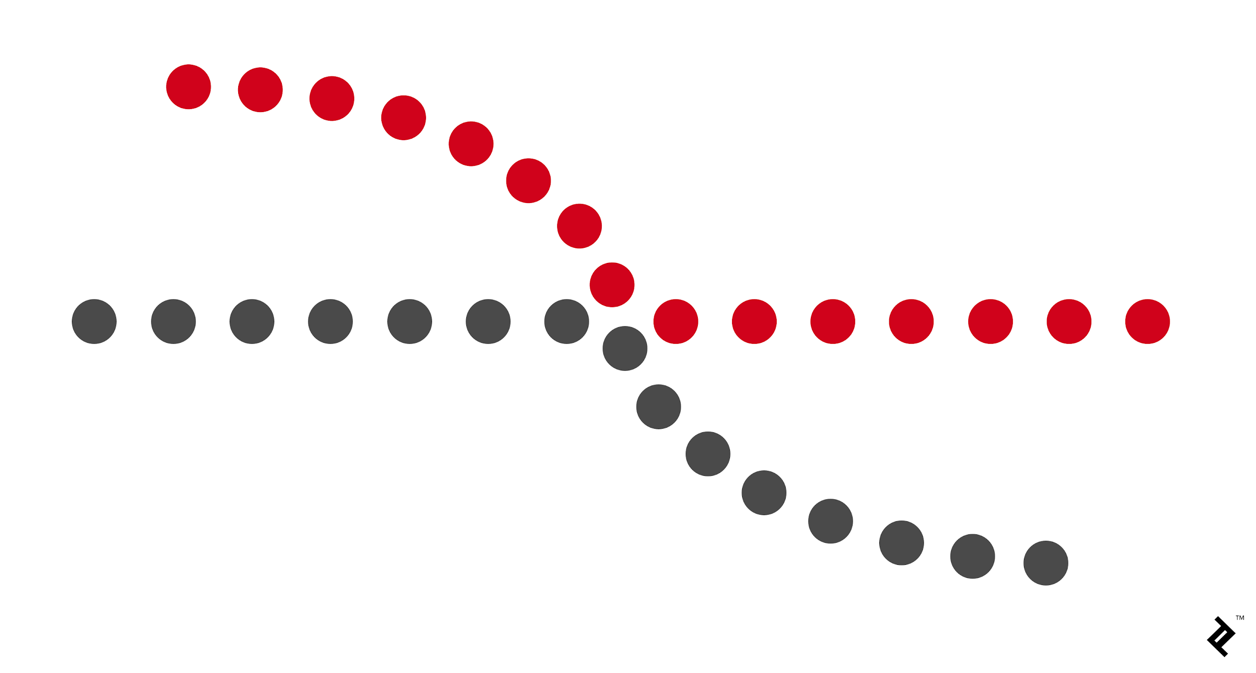
Continuation; is when your eyes move through one starting point to another, when you have movement throughout the design, like an “arrow” pointing you in one direction to another object.. This can be a line or a curve.
Closure; this is when our eyes see an unfilled shape, but our eyes “closes” the design, because there is just enough information to do so. Therefore this is called “Closure”, it is when we complete the shape.
Proximity; This is when single objects is placed close enough together, and therefor are perceived as a group, even though there is distance between the objects, they are seen as a “whole”.
Figure and Ground; it’s when our eyes differentiate an object/shape from its surrounding area. Our eyes see objects, silhouettes or shapes as the figure, while the surrounding white space is seen as the ground. The white space “ground” is as important as the “figure”, they work together to balance one another. It is like when you are reading this text, the text you are reading in this blog post is seen as the figure, and the white space is seen as the ground. There is 3 different types of figure ground relationships, you have:
Stable; this is when you see it clearly what is figure or what is ground. You see right away what dominates the composition.
Reversible; this is when it is tension in the composition, when both the figure and the ground are equally attracting the viewer. This makes the design dynamic.
Ambiguous; this is when elements both can look figure or ground. The shapes of figure and ground can both be interesting, and it will be up to the viewer to decide and find their own starting point of the composition.
Learning Activity – Customise a WordPress Site (8 hours)
Take your theme that you have installed on your hosting account and customise it as per this module. Then I want you to find some WordPress hacks that you can use to customise your website even further. The main thing with this project is to not just do things for the sake of doing them. I would like you to explain the tweaks that you have made and your reasoning for adding certain features. Please upload a Word doc along with your assignment, so that I can see why you’ve made certain decisions.
Hacks tried:
Displaying Relative Dates in WordPress
To add relative dates, I needed to install and activate the Meks Time Ago plugin. Upon activation, I needed to visit Settings » General page and scroll down to ‘Meks Time Ago Options’ section.
This code automatically sets default image linking option to none.
Another hack was the theme DIVI by elegant themes which is the most popular WordPress theme in the world. It is also The Worlds #1 WordPress Theme & Visual Page Builder. The options here are enormous and allows you to do much more.
Learning Activity – Working with WordPress (6 hours)
Firstly you need to download and install WordPress. Then publish it to your web hosting account. Create a subfolder if you wish to avoid conflicts with previous websites.After all the “admin” is complete, you can start having some fun. Choose and download a theme that best suits you and install it. Then customise this theme in order to create a portfolio website for yourself.